Why is the NASA logo so popular in fashion?
This publication is also available in: Français
English (UK)
Deutsch
Italiano
Español
With the Artemis mission reigniting the race to the moon, NASA is starting a new chapter in its history. An event followed by thousands of enthusiasts around the world, fueling the dreams of many Earthlings. The universe of space has fascinated for years, and the popularity of the NASA logo in fashion is a perfect example of this. Let’s take a look back at its history and how this starry logo has carved out a place for itself, even in luxury.
Why is the universe of space so fascinating?
Space is unattainable to us, yet it is all around us, enveloping us with its magic and mysteries. Lying on the ground and looking up at the stars in the sky, many of us have imagined what it must be like to live in space.
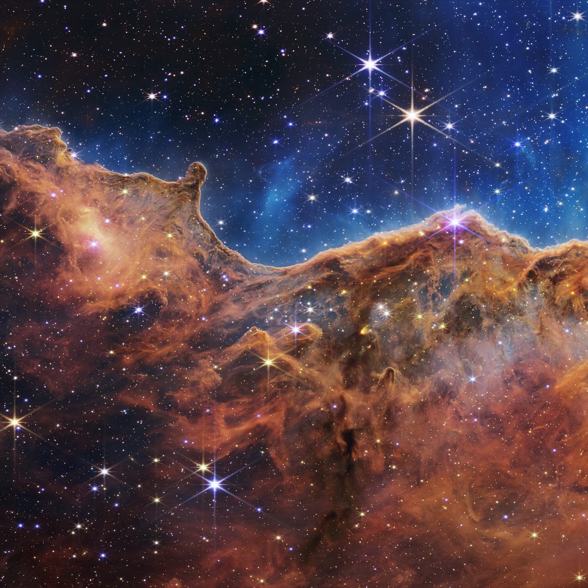
Seeing the thousands of people heading to NASA’s rocket launch sites, the excitement for the aerospace field has never faded since the first step on the moon in 1969. Much like the success of Top Gun in the military aviation sector, films about space have set box office records highlighting this passion, allowing everyone to experience the stratosphere and access the inaccessible.
Making space accessible
With social media and new technologies, astronauts like Thomas Pesquet have provided a new immersive and educational approach to space. Everyone can now discover life aboard the ISS and ask questions to members of the ESA. With 82 million followers on Instagram, NASA can reach a vast audience and make space more accessible to enthusiasts.
With rocket launches on the rise and the emergence of private companies like SpaceX, space exploration and its possibilities continue to open up to new horizons, such as space tourism. A highly debatable topic, but one that gives hope to enthusiasts that one day, perhaps, they too will be able to soar among the stars.
NASA: Symbol of space conquest
NASA, which stands for National Aeronautics and Space Administration, is located in Washington, USA. It hosts the American civil agency and is responsible for carrying out the American civil space program, including research, development, and exploration… This federal agency is one of the world leaders in space exploration. It followed the NACA, National Advisory Committee for Aeronautics.
NASA was established at the beginning of the great race for space exploration on July 29, 1958, by order of President Dwight D. Eisenhower. Its creation took place against a backdrop of the Cold War and a spirit of competition against the USSR, which had marked the first launch into space with their Sputnik rocket. Throughout its years of research, innovation, and missions, the most celebrated being Apollo 1 with the first step of a man on the Moon, who was, moreover, American… NASA has become a symbol of space research and American power.
What is the story of the NASA logo?
Beyond the agency’s achievements, the NASA logo plays a significant role in enhancing its image, appealing to different generations. Indeed, anyone seeing the logo, even without being attracted to or knowledgeable about the space field, will recognize it.
Why has the NASA logo evolved over the years?
Every designer knows how challenging it can be to create a logo that perfectly represents a brand and is approved by all. While we all have the same NASA logo in mind when we think of it, the most popular blue circle was neither the first nor the last logo.
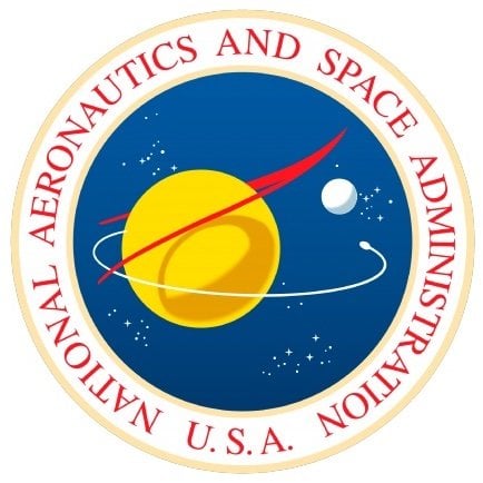
The first version of the NASA logo was created the year following its establishment by illustrator James Modarelli. As NASA took over from NACA, it was necessary to revisit and create its new identity. This first logo received mixed reviews, notably due to the presence of symbols that referenced America a bit too much. Amid suspicions of reproducing the Oval Office, colors and stars of the American flag, and the mention of USA… Although aesthetic, this logo was modified by its creator at the beginning of the 1960s.
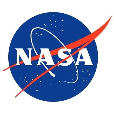
The second logo is the one that belongs to our popular culture and has marked the agency’s iconography. Modarelli thus rethought his first NASA logo into a siglotype version to make it more understated and effective. While keeping the same color scheme, it only inscribed the agency’s acronym.
In 1975, there was a desire to create a stronger and unique image for NASA. Designers Richard Danne and Bruce Blackburn infused a ultra-modern and minimalist vision into the NASA logo, which was simplified to the acronym in red on a white background, with clean typography.
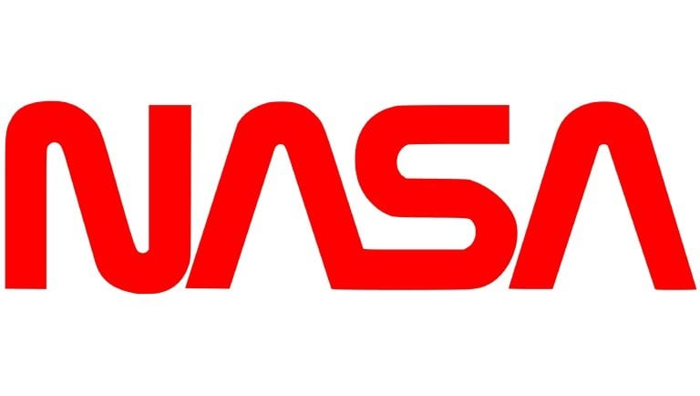
This NASA logo only managed to establish itself for 17 years and earned the nickname “The worm”.
What is the meaning of the NASA logo?
In 1992, a return to the second NASA logo was made. With a touch of nostalgia and reflecting NASA and America’s values, this logo has remained unchanged until now. The only evolution was a version specifically designed for NASA’s 60th anniversary in 2018. This version and the second NASA logo, called “meatball”, propagate the same message.
While the first logo had far too many references to America, and the third had none, the second achieved a perfect balance to highlight its values and its place in the conquest of space. Indeed, through the red arrow, the logo emphasizes NASA’s ambitions for space exploration, both in known territories and new ones to discover. The starry sky, supported by the colors used, allows for a delicate reference to America. An essential reference, as it is worth recalling that the space conquest is a real race in which countries have been competing for many years.
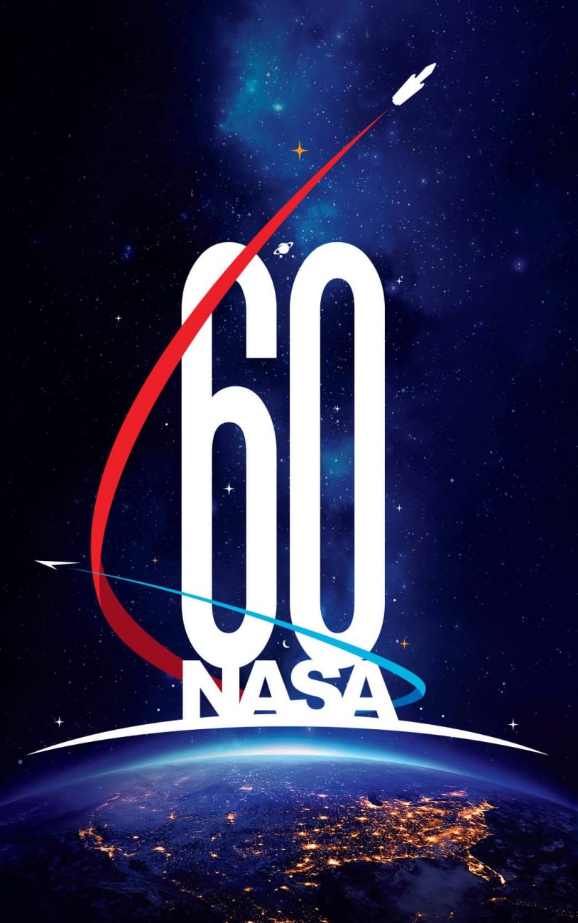
The version designed for the agency’s anniversary emphasizes these points even more, with rockets representing past and future missions in a film poster aesthetic.
How has the NASA logo established itself in fashion?
The NASA logo is one of those iconic elements depicting a trendy image of America. Being one of the most recognized logos in the world, and found on many merchandise across the Atlantic, it has also been highlighted in pop culture. Notably through series like The Big Bang Theory, boosting sales of t-shirts emblazoned with the logo. Additionally, many stars like Anne Hathaway and Rihanna have classified the logo as a must-have by wearing it daily.
Space as an inspiration ground for creators
The success of the logo is particularly highlighted by its presence in both entry-level fashion brands and luxury brands. Alpha Industries, producing the actual NASA suits, has notably contributed to the popularity of derivative pieces by releasing NASA sweaters for the general public.
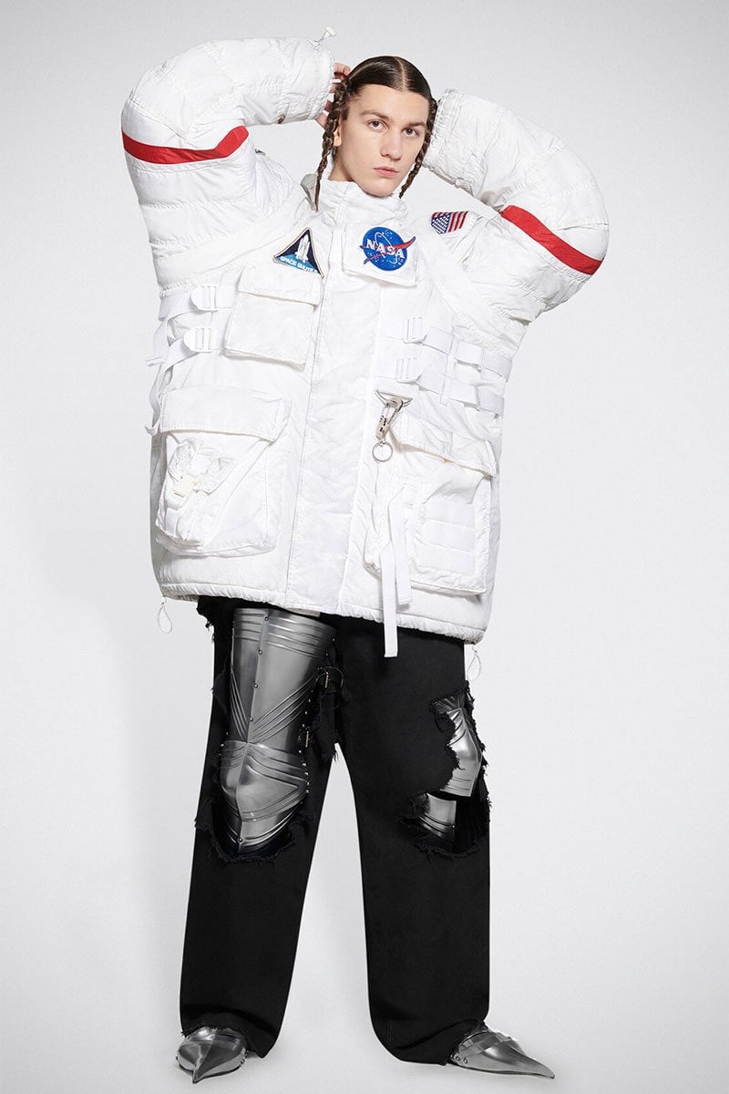
Using both “meatball” and “the worm” logos, designers have created capsule collections around the space organization, like Heron Preston in 2016. Featuring high-tech pants, astronaut jacket models, and backpacks, the designer made a sensation at fashion week. In 2021, Balenciaga followed suit with a collection in the colors of the space agency designed to make you look just like an astronaut. An avant-garde aspect of the new trend of oversized coats arriving this fall-winter.
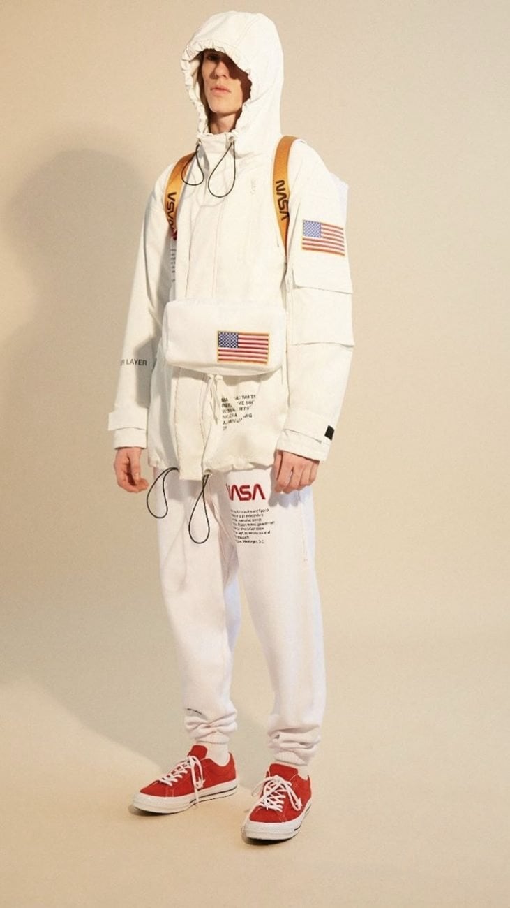

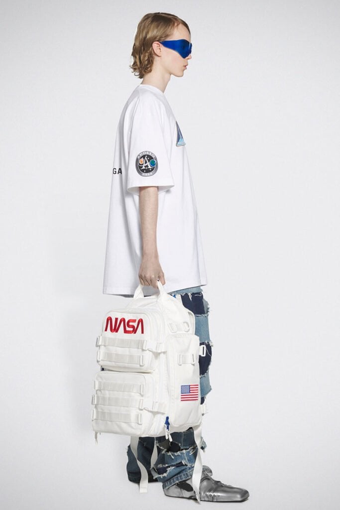
The NASA logo has also established itself outside of luxury, among brands like H&M, Forever 21, Vans, Urban Outfitters, Célio, and Target.
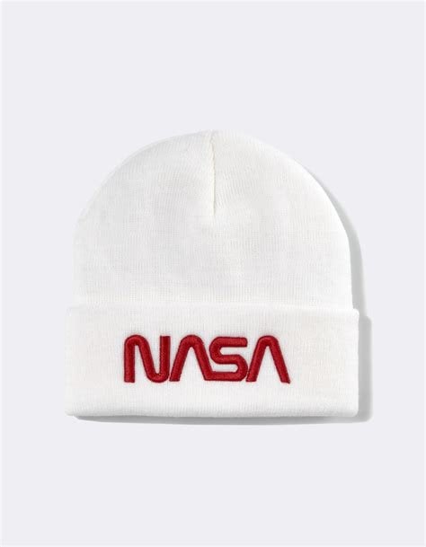
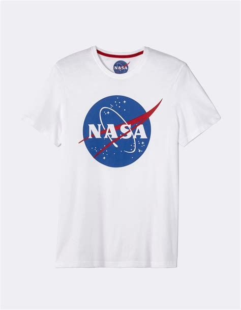
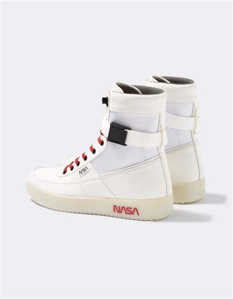
In 2020, it was even found in interior design, being featured on Ikea bedside lamps and tables.
What are the conditions for using the NASA logo?
The vast array of derivative products featuring the NASA logo is explained by the fact that it is part of the American public domain. The governmental organization does not profit from it and allows its use by brands under certain conditions. As Bert Ulrich, in charge of NASA’s communications, explains, any use will be accepted if the specifications are respected. And it only takes an email to get permission to use the logo!


