Mocha Mousse: The Soft Hue That Calms Children’s Rooms
This publication is also available in:
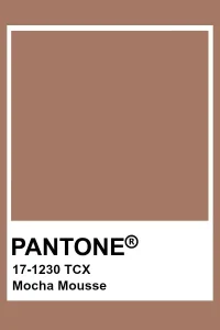
Among the shades that gently redefine children’s rooms, mocha mousse quietly asserts itself. Between soft beige and light brown, this natural color brings a discreet and enveloping warmth. Neither pronounced nor gendered, it creates a peaceful atmosphere, conducive to both rest and calm play. Inspired by raw materials and mineral hues, it captivates with its simplicity and its ability to transcend ages. More than just a trend, mocha mousse reflects a desire to return to essentials — a soft, reassuring aesthetic designed to last.
Color as Refuge
Mocha mousse evokes a muted world, between the softness of a latte and the patina of old wood. It embodies a direct response to the visual acceleration of our interiors: a color to slow down, breathe, and refocus. At the crossroads of earthy and powdery shades, it shapes calm and enveloping spaces where children can grow without overload.
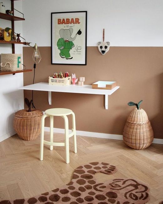
Far from the clichés of pink or blue, mocha mousse stands out with its warm neutrality. Neither cold nor bland, it integrates into all styles — from the most minimalist to the most bohemian — while maintaining a true presence. It dresses a room without ever weighing it down and adapts to all stages of childhood, from the crib to the makeshift fort.
An Atmosphere Designed for the Child
In an approach inspired by Montessori pedagogy, color plays a central role in building the connection between the child and their environment. Mocha mousse, with its visual softness, promotes concentration, sleep, and observation games. It reduces what experts call “visual noise” and makes room for the essentials: shapes, materials, gestures.
In a room painted in mocha mousse, light naturally softens. The tone reacts to the hours of the day: more golden in the morning, more muted in the evening. This creates a sensory rhythm that accompanies the child’s routines without interruption. The space becomes a cocoon, a gentle transitional area between indoors and outdoors, wakefulness and rest.
Mocha Mousse in the Hands of Creators
Several brands sensitive to design and natural materials have embraced this hue in their collections, with consistently coherent and inspired choices.
At Garbo & Friends, mocha mousse is available in organic cotton percale sheets, floor mattress covers, and cushions with embroidered finishes. The fine, slightly crumpled textures play with shadow and light to make the hue vibrate without ever overpowering it.
Nobodinoz, an essential Barcelona-based brand, reinvents essential textile furniture with a graphic eye. Tipis, floor mattresses, bath capes: everything is designed to last, in Oeko-Tex certified materials and natural shades. Their mocha sometimes leans towards caramel or cinnamon, for an even more enveloping effect.
Bonton Home, finally, showcases the color on painted furniture pieces or modular accessories: storage baskets, small benches, rounded lamps. The result: a universe that is both structured and soft, where color creates a link between objects without ever dominating.
An Evolving Base for a Growing Room
One of the great strengths of mocha mousse lies in its ability to evolve. It functions as a backdrop, a solid base upon which decoration can evolve over the years. Matched with sage, old rose, or patinated brass tones, it offers more sophisticated, almost adult-like atmospheres without losing its tenderness.
The material plays a key role: washed linen, corduroy, raw wood, or boucle wool reinforce the impression of comfort and quality. In a teenager’s room, the hue maintains its legitimacy: it enhances personal objects, posters, and tactile materials. It never freezes — it accompanies.
A Silent Elegance
In a decor universe often saturated with trends, mocha mousse offers a precious alternative: that of quiet elegance. It does not seek to impose itself. It sets the mood, allows the space to breathe, and respects the child’s rhythm. It is a hue that lives with light, with materials, with time.
Adopted by the most demanding brands in the industry, it embodies a discreet and sustainable luxury — that of a universe thoughtfully designed with care, meaning, and sensitivity.


